The customer experience can make or break your business. That’s true from the little details of your social media posts and website design to the packaging you use for your products. McDonald’s is a fantastic example. It probably brings back the nostalgia of tearing into a Happy Meal as a kid. It’s an exciting experience that starts the second you walk in and continues all the way down to ripping open their packaging. This doesn’t happen by accident. It happens by design. They spent years perfecting their brand to create an excellent (and consistent) customer experience, regardless of the restaurant customers choose to visit. So, even the most memorable brands leverage consistency to create a community of loyal customers anxiously awaiting their next experience. And while McDonald’s has a massive marketing and design team to help them out, you can do the same thing. Even if you’re a small business or solopreneur. In fact, it’s especially important if you are. However, if you’re struggling to find branding and packaging consistency, you’re in the right place. In this article, we share our top pro-tips for incorporating your brand into your product packaging. Let’s get started!
Get inspired by my personal favorite: Uprising Foods
We’re going to go deep today, so let’s start with a little inspiration. So many customers have amazing packaging that it’s extremely difficult for me to pick favorites. But if I had to, it would be Uprising Food. Few companies do such a good job creating a seamless branding and packaging experience, let alone small upstarts.
Consistent packaging design starts with a story
Before you start designing your packaging, it’s crucial to have a solid understanding of your brand, values, and voice. Knowing this ahead of time makes package design a much easier process. While your colors and logo are important, your brand story is what makes you stand out. You probably have an idea of your story and your “why”. But it’s crucial to share it with everyone involved in the design process. To do that, you need to define it and write it down. So, take some time to really dig in and work through your brand story. It may help to think about where you started, why you started, and where you hope to go in the future. You can also consider:
Your company mission:
Where you live and your impact on the community?
How you developed the idea behind your products?
What your ideal future looks like?
How you can help shape that ideal future?
Real-life stories that shaped your business?
At the end of the day, authentic brands win. So, don’t force it or make up stories. Really draw on what makes your business and products or services special. Once you truly understand your story and voice, you’re ready to start designing.
1. Consider the purpose of your packaging
Are you designing packaging for a product that sits on the shelf or something shipped in the mail? This is a crucial element to consider before doing anything else. E-commerce products require more protection because they get tossed around in a mail truck several times a day. Furthermore, they potentially face elements like rain, cold, and heat. So, you have to consider how you’re going to protect what’s inside. With that said, the unboxing experience may be one of the last touchpoints someone has with your brand. So, design and customer experience are just as important. On the other hand, products on a shelf have to stand out in a sea of similar products. They don’t need as much protection, but you never know what’s going to happen after it leaves your hands. Design something sturdy, but first and foremost consider how it’s displayed in the store and design something that immediately catches the eye. In this situation, consumers may not know anything about your brand, so you have a different customer experience to manage.
2. Use consistent branding and packaging color schemes
Your branding colors can be immediate identifiers of your brand, along with your logo. So, using the same color schemes in your packaging is a smart move. When you think of T-Mobile, you probably immediately see the hot, bold pink color they use to define their brand. And if you take a look at their product packaging, they leverage that immediate color recognition. You don’t have to guess who’s behind the product. Babe’s custom beverage boxes are another excellent example. They sell bubbly, canned wine in three unique flavors. Their boxes utilize their unique brand colors to create recognition and a feeling of overwhelming excitement the second you see the box. They use the same colors on their website and across their social media presence, as well. This creates an incredibly cohesive experience from the first touchpoint to the last.
3. Make your packaging immediately recognizable
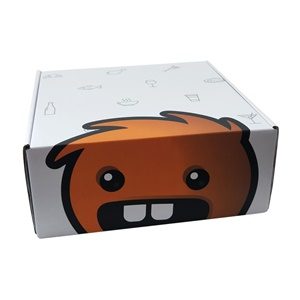
Do you have a signature font or a unique logo that directly identifies who you are? If so, product packaging is an excellent place to show it off, regardless if it’s on a shelf or making its way through the mail. Creating that immediate recognition doesn’t have to happen solely through color. It could be anything that makes your brand noticeable. You want your customers to feel excited as they open their new *insert product here. That excitement can (and should) start as soon as they see your package sitting on their front porch or your product sitting on the shelf at their favorite store. Their boxes are immediately recognizable as soon as you see them. Rather than using color, the bold shapes and fun, puppy-inspired design really drive that recognition home. And… their packaging doesn’t make you wonder what’s inside.
4. Think about your audience’s expectations
It’s crucial to consider where your audience is in the sales funnel, what they already know about you, and their expectations. If someone’s already ordered something online, they know more about you than someone seeing your product on the shelf for the first time. As such, you don’t need to use space going into detail about who you are and what you do. Instead, you can use that space to tell a story or share an encouraging message. But on the other hand, someone picking your product up on the shelf may need to know more about your brand before they decide to buy. Both experiences are critical, but they shouldn’t be handled the same. Why? Because the exact same customer has different expectations for each situation. If they ordered online, they expect their item to show up in one piece with an exciting unboxing experience. However, someone buying in the store doesn’t have those same expectations. So, it’s essential to consider how consumers experience your packaging and what they expect. Furthermore, consider what they expect from a design perspective. If they know your brand as minimal and luxurious, you should work to match this expectation in your product packaging regardless of where they’re buying from.
5. Consider holidays and current marketing campaigns
If you plan to run any significant marketing campaigns in the future, you can create brand and packaging cohesion by designing your packaging to match the marketing campaign. Alternatively, you can add a bit of excitement by designing packaging around holidays. Holidays spark joy in general, so it’s a smart idea to use that excitement to your advantage. These are great opportunities a lot of brands miss:
Customer birthdays and significant milestones
Current events or hot topics
Upcoming events
Different seasons
New product launches
This is also an excellent opportunity to branch out from your traditional branding color schemes. You can try new colors and designs, or incorporate traditional design elements and ideas with your standard brand colors. Just make sure you don’t get too crazy since everything should still feel cohesive
6. Consider it an extension of your website and digital presence
Unlike your website and digital presence, product packaging is something your customers get to interact with, feel, and touch. However, creating a top-notch branding and packaging experience relies on cohesiveness from one platform to the next. Consider the elements you use on your website, the colors you frequently use on social media, and the feel of your physical location (if you have one). You don’t necessarily have to be obvious about it, though. Even subtle consistencies go a long way. After seeing it, you expect fun, bright, and airy packaging to match. And the good news is that they don’t disappoint. You can immediately tell it’s the same brand with the same quirky and fun designs. The consistency is subtle, but it’s just enough that it’s noticeable.
7. Find the golden balance of simplicity and functionality
One of the golden rules of package design is to avoid over-designing. The most iconic and exciting packaging tells a complete story without including any elements that take away from what they’re trying to say. And sometimes, the best packaging includes nothing but a brand color and logo. Product packaging doesn’t have to be anything fancy to get your point across. In fact, simplicity also sends a message. This is why it’s crucial to understand your brand, principles, and values before you get started. If you go back and look at the examples we shared here, you’ll notice they’re all relatively simple. There’s nothing crazy or fancy going on. But they do offer insight into what they do and who they are. With that said, functionality and protection are just as important as packaging design. Packaging that doesn’t function as it should also sends a message. And it’s probably not the message you’re going for. So, it’s important to find the perfect ratio of simplicity and functionality.
8. Keep your brand values and principles in mind
One of the best ways to stay consistent with your branding and packaging without becoming repetitive is to start designing with your brand values in mind. If you value humor, as Vowed does, brainstorm creative ways to include something funny or witty in your packaging design. On the other hand, if your brand is more inspirational, consider adding a nice quote or an uplifting message on the inside. Instead of words, you could include a picture, icon, or a repetitive pattern that matches your core values. Or you could use different colors to portray what you care about as a company. And it doesn’t have to be on the box. You could incorporate it with custom tissue paper, a handwritten note or drawing, a postcard, or even a few extras you include in every box. With packaging, a little bit goes a long way. So, you don’t have to go overboard. But if you’re stuck, always go back to your values and principles. If you’re toying between a few different designs, always go with the one that matches your customers’ expectations and your company values.
9. Struggling with branding and packaging? Hire a designer!
If you’re still struggling to land on the perfect packaging design, another option is hiring a designer. This is why it’s important to start with a strong and defined brand story. Once you have that, you can easily pass it along to a professional designer. They’re skilled in turning your brand story + values into beautiful and functional product packaging. So, you don’t have to worry and stress over it if designing isn’t up your alley, or you don’t have an in-house design team. Plus, it doesn’t have to cost an arm and leg.
Our last pro-tip: invest in high-quality packaging materials (we happen to know someone who can help you out)
High-quality packaging and printing are key to bringing your ideas to life. Without those two things, you may end up with lackluster packaging, regardless of how great your design is. we use nothing but the highest quality materials, and our printing processes are second to none. Plus, our 3D real-time design tool is kind of a big deal. You can use it to get an idea of what your packaging looks like before you ever spend a single penny. And not to brag, but we take pride in making the process as easy and painless as possible (even if you’re not a professional designer). Now, you have all the tools you need. So, click here if you’re ready to bring your branding and packaging ideas to life—ultra high-quality packaging and printing methods included.
